Are you interested in updating your eLearn course to enhance the navigation and user experience for you and your students?
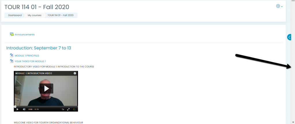
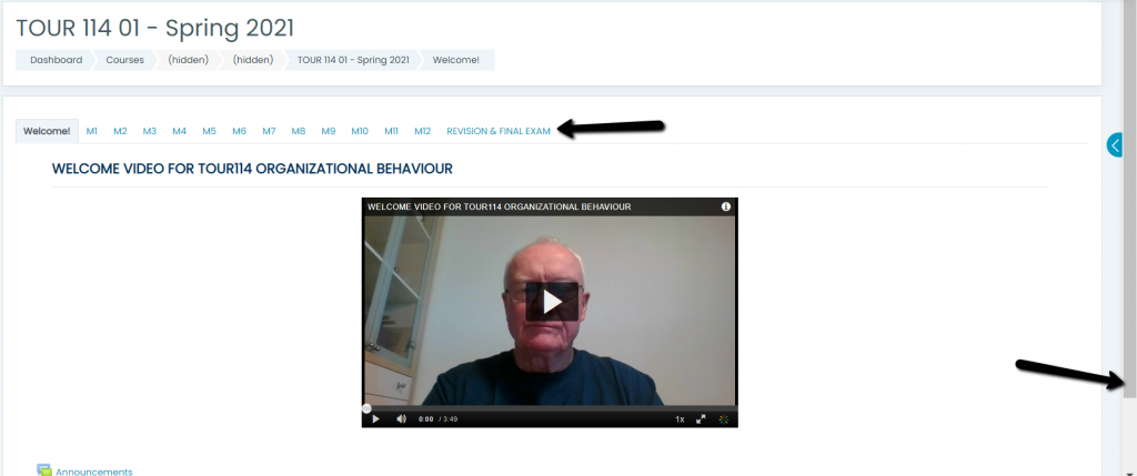
I recently had the opportunity to work with Rick Davies from the Tourism department – while assisting him preparing his courses for the Spring Semester I recommended a few tips and tricks to improve and enhance his courses. Firstly, we changed the course format to reduce the amount of vertical scrolling – as you can see from the before and after screenshots below. In the Before screenshot you see the scroll bar is activated and in order to move to the subsequent topics you need to use the scroll bars up and down. In the After screenshot you see that we have eliminated the scrolling by using a “tab” based navigation and the user simple clicks on each tab to go to the next topic.
Before

After

The navigation of your eLearn course is addressed by Section 6: Weekly Flow and Navigation of the CTE Online Course Quality Checklist located here. You can also refer to the Guidelines for Effective Online Teaching – The Ten Essentials located here
If you are interested in this eLearn Xtreme Makeover session please email CTE = cte@capilanou.ca and one of our team members will be in touch to book a consultation time for you.

Recent Comments