Accessibility Checker
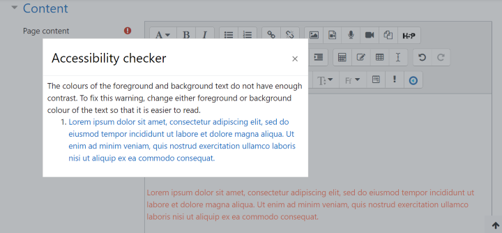
In our last update to our eLearn Learning Management System, which is built in Moodle, the Brickfield Accessibility Starter tool was added to the Atto Editor. You’ll find it amongst the buttons at the top of every text box:
The tool will give you quick feedback on colour contrast, text readability, alt text and captions as well as accessible table layout on the page. Fixing these settings will make it easier for students using screen readers to access the content of your course site and for students with low vision to read the screen.

The screen reader helper tool is right next to the accessibility checker and provides you with an outline of the headings and contents of the page so that you can check for consistency and clarity. Check that the headings H1, H2, H3 are nested properly so that the hierarchy makes sense to a screen reader.

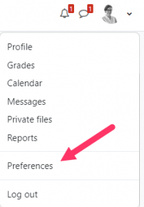
To change your editor to the Atto Editor, go to your Profile in the upper right corner of the screen and choose Preferences

: Faculty Help: Change editor preferences | Capilano University eLearn (capu.ca)
Here are some other things to consider when building your course pages in Moodle:
Organizing the content
- Ensure that all text entered into Moodle via the Moodle text editor is structured using Headings. Don’t use bold, colour or other formatting to indicate document hierarchy and structure. This structure allows students using screenreaders to jump to the section they want to read.
- Use headings in sequence (i.e. Heading 3 is larger and comes before Heading 4)
- Don’t use colour alone to identify important information
- Ensure that there is enough contrast between text and background for the content to be viewed easily.
- Don’t use tables to format content and keep them simple when you do use them.
Images and Multimedia
- Add descriptive alt text to images. For images that are purely decorative, the “This image is decorative only” checkbox is checked. For more complex images, use the caption to explain in more detail.
- If images rely on colour alone to convey information, add some text explanation.
- Add captions and transcripts to videos (Kaltura has an autocaptioning feature)
- Edit captions for accuracy – automatically generated captions are usually only about 75% accurate.
Documents used in the course
- Make sure that Word documents, Powerpoint presentations and PDF documents are accessible.
- Make your Word documents accessible to people with disabilities – Microsoft Support
- Make your PowerPoint presentations accessible to people with disabilities – Microsoft Support
- Creating accessible PDFs in Adobe Acrobat
Links
- All links must be discrete and descriptive. Don’t include the URL in the name – a screenreader will read every letter.
- Where links open a new tab or window, make sure that this information is included as part of the link text.
Tables
- Heading rows in tables must be identified, and tables only used to display data rather than as means of page layout. Screen readers will read these in a particular sequence which may not make sense in terms of the content. Keep them as simple as possible.
Formulas
- Equations written in plain text use proper symbols (i.e., −, ×, ÷) will be accessible to screen readers. For more complex mathematical equations, the Equation Editor will give you access to a more complete set of symbols.

A Deeper Dive
Ready for a deeper dive into online Accessibility? Check out these resources:
How People with Disabilities Use the Web | Web Accessibility Initiative (WAI) | W3C
Better Web Browsing – Tips for Customizing Your Computer
Moodle Accessible Design with the Learner in Mind (youtube.com)
13 Days of Accessibility (kaseybon.com)
Recent Comments